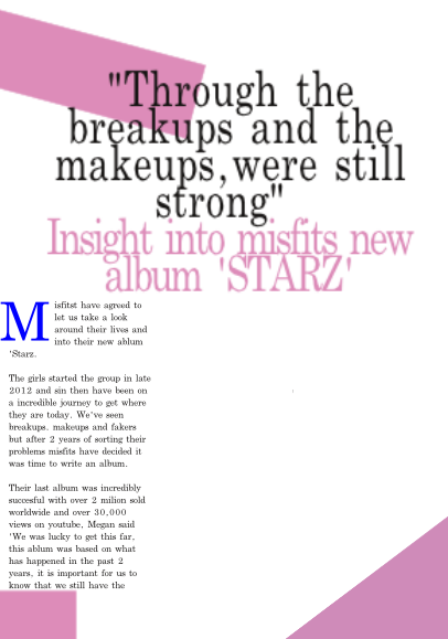
 When i got the style for my title i then had to choose what colour to put my first letter as because that was going to be my stand out letter.
I thought that maybe the first letter should be the same colours the background blocks on the page but when i did it, the colours just clashed and made the page look boring and colourless.
So i then decided to go for a deeper and darker pink but it again didn't look right, it was still to pink and the colours clashed worse with the rest of the page.

so i decided to try the colour i used in my contents page, a dark blue, in preferred this so much more it bought the page together and make it look colourful when the page is all put together

i then decided that having the bit of colour with the letter wasn't enough i need more colour on the page, so i thought that changing the colour of every other paragraph would look better and it did, it added a slight amount of colour to the page without it over powering the rest of the writing or the background.
The box is where i will add a picture.
I then thought that the colour should have another amount of colour so i added a symbol at the top to make the colour of the page more powerful and it also highlights that this would be the main focus of my magazine.


No comments:
Post a Comment