Monday 27 April 2015

Final contents page


Final magazine cover


Double page spread writing ideas


When i got the style for my title i then had to choose what colour to put my first letter as because that was going to be my stand out letter.

I thought that maybe the first letter should be the same colours the background blocks on the page but when i did it, the colours just clashed and made the page look boring and colourless.

So i then decided to go for a deeper and darker pink but it again didn't look right, it was still to pink and the colours clashed worse with the rest of the page.


so i decided to try the colour i used in my contents page, a dark blue, in preferred this so much more it bought the page together and make it look colourful when the page is all put together


i then decided that having the bit of colour with the letter wasn't enough i need more colour on the page, so i thought that changing the colour of every other paragraph would look better and it did, it added a slight amount of colour to the page without it over powering the rest of the writing or the background.
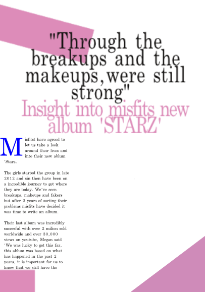
The box is where i will add a picture.
I then thought that the colour should have another amount of colour so i added a symbol at the top to make the colour of the page more powerful and it also highlights that this would be the main focus of my magazine.

Double page spread background edits

 For my double page spread I based the design around the the magazine I used as inspiration, I have used colours similar to the background colour on my home page. the colour is slightly darker but works better with my contents page. My title and quote are made bigger than the rest of the story to make it more eye-catching and to make it stand out.

This one I did change because i felt that the title was to small, not bold enough and didn't stand out enough for my magazine.

 I preferred this one because it stands out all more and looks a lot more together, the colours are bolder and it fits better on the page.


In the magazine I took inspiration from the one side of the magazine had writing on and the opposite sign only had a picture of the main focus of the article. On the side where there was just a picture it also had a label with the name if the group and the logo of the magazine, I have used this idea to tie my magazine together and make it look better

This is my finished background and writing ideas, I have changed the colours of some of the writing to make it look a lot more suited to the magazine it also adds colour and makes the article stand out a lot more.